
What Colors Make Your Room Look Bigger | Barrington Guide
If your Barrington home feels smaller than it should, the answer may sit inside a paint can. The right wall colors reflect light, soften edges, and trick the eye into seeing a bigger, brighter room, while the wrong shade can make even a large space feel tight and closed in.
This guide breaks down the exact colors, finishes, and design tricks that open up small rooms, backed by CPR Home Solutions‘ hands-on experience remodeling Barrington homes where the right color choice made all the difference.
Why Room Color Choice Matters More Than You Think
Color is a factor in how the brain reads a space, well before furniture, layout or lighting come into play. A fresh coat of paint in the right color can change the way a room feels in just a weekend, though homeowners who want to make a room look bigger often think they have to get new furniture or do a whole renovation.
Light paint colors for small rooms bounce sunlight and artificial light around the walls, while dark or saturated tones absorb light and pull walls visually closer together. Choosing the right interior paint colors for small rooms is one of the most affordable ways to create the illusion of extra square footage, and it works in bedrooms, hallways, kitchens, and basements alike.
The Psychology Behind Color and Perceived Space
Color perception plays a bigger role in how spacious a room feels than most homeowners realize. Two rooms with identical square footage can feel completely different in size depending on wall color, ceiling color, and the way light bounces off every surface. Understanding a bit of color psychology in interior design helps homeowners pick shades that actually work with a room’s shape, not against it.
How the Eye “Reads” Light vs. Dark Surfaces
Our eyes see light colors as if they’re farther away, while dark colors seem to come closer. That’s why painting a small room in a light shade makes the space feel bigger, the walls reflect more light, edges soften, and the corners seem to stretch out. Go with darker colors, like charcoal or navy, and everything shifts in: those walls absorb light and seem to advance, making the room feel cozier, or even a bit closed in. If you want your room to feel more open, stick to lighter shades. Still, a bold dark accent here and there can look great if you balance it right.
Why Undertones Trick the Brain Into Seeing More Room
Every paint color carries an undertone, even the whitest whites. A “white” with a pink or yellow undertone can feel warm and cozy, while a white with a blue or gray undertone feels crisp and expansive. Undertones matter because the brain reads subtle color shifts even when a wall looks plain white at first glance. Picking a light neutral color with a cool, clean undertone tends to open up a room better than one with a warm undertone, especially in rooms that already run small or dim.
Warm Tones vs. Cool Tones: Which Expands a Room Faster?
Color temperature has a direct effect on how spacious a room feels. Warm tones and cool tones send different visual signals to the brain, and knowing which one fits a specific room helps homeowners avoid a costly repainting mistake.
Where Cool Blues and Greens Work Best
Cool colors for small rooms, such as soft blue walls or pale green paint, tend to recede visually and open up tight spaces. Cool tones work especially well in rooms that already get plenty of natural light, since blues and greens can feel a bit cold in a dim or north-facing room. A soft blue bathroom or a pale green home office often feels airier and calmer than the same room painted in a warm shade.
When Warm Neutrals Actually Feel More Spacious
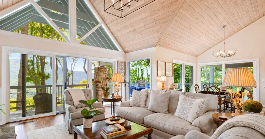
Warm neutrals, including cream wall colors and soft beige tones, can also open up a room, particularly one that lacks natural light. Warm tones add a sense of comfort without the heaviness of a true dark color, which makes them a strong choice for basements, interior hallways, and rooms with small or few windows. The goal stays the same either way: choose a shade with a high light reflectance value (LRV) so the wall bounces light rather than swallowing it.
The Best Paint Colors for Making Small Rooms Feel Larger
Homeowners searching for the best paint colors for small rooms usually land on a short list of reliable shades. Each option below works differently depending on lighting, room size, and the mood a homeowner wants to create.
| Color Family | Best For | Why It Works |
| Soft Whites & Off-Whites | Living rooms, kitchens, hallways | Classic, versatile and maximum light reflection |
| Light Grays & Greiges | Bedrooms, bathrooms | Reflects light and adds a hint of warmth |
| Pale Blues & Airy Pastels | Bathrooms, home offices | Cool tones recede, feel calm and open |
| Color palettes in monochrome | Small or oddly shaped rooms | Removes visual breaks so the eye keeps moving |
Soft Whites and Off-Whites
White walls are still one of the best ways to make a room look larger and brighter. Soft, warm whites reflect a lot of light, but avoid the starkness of a blue-based white. Off-whites complement wood tones, natural light and most furniture styles, making them a solid option for resale value, too.
Light Grays and Greiges
Soft gray paint sits between warm and cool, giving a room a modern, airy interior design feel without going too stark. Greige, a gray-beige hybrid, works especially well in rooms with mixed natural and artificial lighting throughout the day, since it shifts subtly depending on the light source.
Pale Blues and Airy Pastels
Airy interior paint colors to make a room appear larger include lavender paint, pale green paint and soft blue walls. Pastels work best in rooms with lots of natural light, as low light can pull the color toward gray or muddy.
Monochromatic Color Schemes
A monochromatic color scheme uses different shades and textures of a single color across walls, trim, and sometimes furniture. Removing sharp color contrast lets the eye travel smoothly around the room instead of stopping at each wall, which creates a stronger sense of continuous, open space.
How Natural Light and Window Placement Change Your Color Choice
Natural light and paint colors work together, so the same shade can look completely different depending on window placement and time of day. Barrington homes with large windows facing open yards behave differently than city-style homes with tighter window placement, so testing paint swatches at different times of day matters before committing to a full room.
Choosing Colors for North-Facing vs. South-Facing Rooms
North-facing rooms tend to experience cooler, flatter light all day, so warmer whites and soft neutrals help balance out the light. In small rooms that face south, you have plenty of warm sunshine all day long, so cool colours such as soft blues and grays work best in that orientation.
Rooms With Little to No Natural Light
Rooms with little or no natural light benefit from the lightest end of the paint color chart, paired with strong artificial lighting and reflective surfaces such as mirrors or glossy trim. Artificial lighting and wall colors need to work as a team in these spaces, since warm-toned bulbs paired with a cool wall color can create an odd, muddy effect.
Beyond Paint: Color Tricks That Add Extra Depth
Wall paint plays a major role, but ceiling color, finish, and flooring all shape the final result. Space-enhancing paint colors work best as part of a full room strategy, not a single wall decision.
Ceiling and Trim Color Strategies
Ceiling colors to make rooms look taller usually sit a shade or two lighter than the walls, which pulls the eye upward and adds a sense of height. Painting trim a crisp white against a soft wall color also adds definition without breaking up the open, airy feel.
Using Reflective Finishes and Sheens
Paint finish changes how much light a wall reflects. A few common options:
- Matte paint finish – low shine, hides wall imperfections, absorbs more light
- Eggshell paint finish – slight sheen, good balance of light reflection and durability
- Satin paint finish – noticeable sheen, reflects more light, easy to clean
- Glossy paint finish – highest shine, best for trim and reflective surfaces
Flooring and Furniture Color Coordination
Light flooring paired with light walls removes the visual “stop point” where floor meets wall, extending the sense of space. Furniture in colors close to the wall shade also blends into the background rather than breaking up the room visually.
Adding Accent Colors Without Shrinking the Room Again
Accent walls and bold colors do not have to work against an open, spacious room design when used with a bit of restraint.
The One-Wall Rule for Bold Colors
Keeping bold color to a single wall, usually the one farthest from the entry, adds personality without closing in the whole room. Every other wall stays light, which keeps the overall interior color palette balanced.
Avoiding the “Tunnel Effect” With Contrast
Painting two facing walls in a dark, bold color creates a tunnel effect that visually shortens a room. Spreading contrast unevenly, with one bold wall and the rest light, avoids that trap while still adding visual depth in interiors.
When Paint Alone Isn’t Enough: Barrington Homes That Need More Space
Paint solves a lot, but it can’t fix every space problem. Some Barrington homes have layout issues that no amount of color can fix.
Signs a Room Needs a Layout Change, Not Just a Repaint
A few signs point to a layout, not a color, problem:
- Furniture barely fits no matter how it is arranged
- Doorways and walkways feel cramped even with light walls
- A kitchen or bathroom lacks usable counter or storage space
- A basement feels low, dark, and boxed in despite bright paint
How Basement, Kitchen, and Bathroom Remodels Solve Space Problems Long-Term
A basement remodel, kitchen remodel, or bathroom remodel can open a floor plan, add windows or lighting, and reconfigure layout in ways paint never can. Combining smart wall colors with a well-planned remodel gives Barrington homeowners the biggest, most lasting improvement in how a room looks and feels.
Why Barrington Homeowners Trust CPR Home Solutions for Space-Maximizing Remodels
Color can only go so far when a room’s layout truly limits how it functions. CPR Home Solutions, Inc. helps Barrington homeowners take the next step, turning small, awkward rooms into spaces that feel open, comfortable, and genuinely bigger.
Personalized Design Guidance From the Owner, Not a Call Center
Every CPR Home Solutions project includes direct access to the owner, not a rotating call center team. That personal touch means design decisions, including color and layout choices, are made with a full understanding of the home and the homeowner’s goals.
Turning Small, Awkward Rooms Into Functional Living Space
From cramped basements to outdated kitchens, CPR Home Solutions specializes in reworking layouts so every square foot works harder. Pairing the right paint colors with a thoughtful remodel gives Barrington homeowners a room that looks bigger and actually is bigger.
Ready to see what a Barrington home could look like with the right colors and the right layout? Reach out to CPR Home Solutions for a personalized consultation.
Conclusion
Choosing the right colors makes a real difference in how big and bright a room feels. Light shades like soft white, pale gray, and airy blue reflect more light and open up tight spaces, while dark, saturated colors close a room in. Ceiling color, paint finish, and natural light all play a part too, so a full color strategy works better than picking one wall shade alone.
Still, paint has limits. When a Barrington home’s layout truly holds a room back, no color trick can fix it. That’s where a thoughtful remodel steps in, and CPR Home Solutions is ready to help turn any small, awkward room into a space that looks and feels genuinely bigger.
FAQs
What colors make a room look larger?
Light, soft shades such as white, pale gray, light blue, and soft cream make a room look larger because they reflect more light and visually push walls outward.
What are the top 3 bedroom colors?
Soft gray, warm white, and pale blue rank as the top bedroom colors, since they create a calm, spacious feel while still supporting a good night’s sleep.
What is the 3-colour rule in interior design?
The 3-color rule suggests using one dominant color (60%), one secondary color (30%), and one accent color (10%) to keep a room balanced without overwhelming the space.
How to make rooms look bigger?
Use light wall colors, keep the ceiling a shade lighter than the walls, add mirrors, maximize natural light, and choose furniture that matches the wall tone.
How to make a room look more attractive?
Combine a clean, light color palette with good lighting, uncluttered furniture arrangement, and one or two accent pieces or colors to add personality without crowding the space.